 Charting our Power
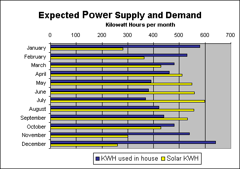
Power over the year
Problem: We use most of our power when the sun position is not at its best. We generate more power in the summer, and use the power in the winter. Similarly, we use more electricity at night.
Solution: When we generate excess power, we supply other houses in the neighborhood while our electricity meter spins backward.
The chart below shows the power differences on a monthly basis.
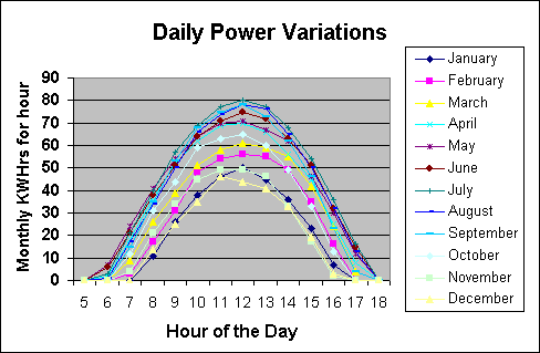
Obviously, power flows better when the sun is high and hot. The amount of power generated per hour each day follows a haystack curve. The winter months show a smaller haystack since the day is shorter and the sun is lower in the sky.
These numbers are estimates, gleaned from the California Energy Commission's Clean Power Estimator. We were able to specify where our house is located, along with the brand and size of the solar cell array. Try it yourself.